IAS371: Pastel
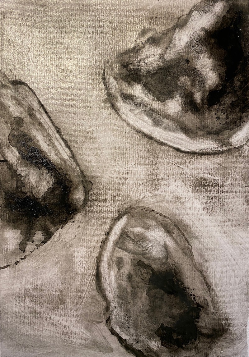
I prepared a variety of grounds - wash, frottage, writing, graphite, sealant and chalk paint and thought I'd see if I could colour over or back into some blue ink (didn't work very well). I enjoyed the richness and paint-like quality of the pastel - messy but divine. Working with methylated spirits to embed the pastel into the surface gave a variety of layered effects. I enjoyed most using white pastel with a small amount of grey or black. The sealant added to nice shine to the pieces. Also, there's a desire to prepare more detailed grounds with maybe graphite and then place shapes on top it without trying to blend them together - for the shapes to just exist and float in their own world separate and distinct from the background. I'm also noticing a desire to be more exact in my shape-making and use protractors and rulers and carefully measured stencils. Bizarre... never thought that would happen.